Client: Loose Associations – association for contemporary artistic practices
Design studio: Design Studio Ivan Goran Žunar
Design: Ivan Goran Žunar
Year: 2018.
Logo of Pediatric marine health resort Krvavica consists of a sign shaped according to the characteristic motif of the roof on a building and it is characterized with dynamic spiral of movement achieved with slant lines varying in thickness and permeation of closed and open space according to the typology of architecture and the typogram whose serifs follow the dynamics of movement in the sign, emphasized by the contrast of smaller and larger, and thicker and thinner.
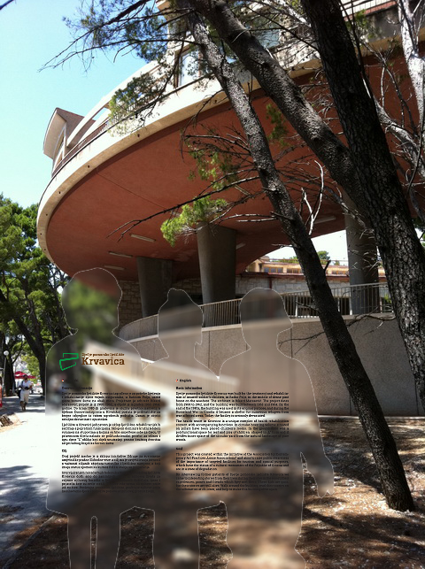
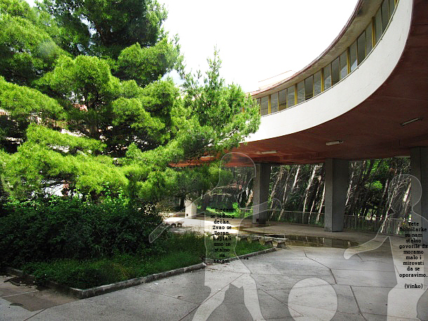
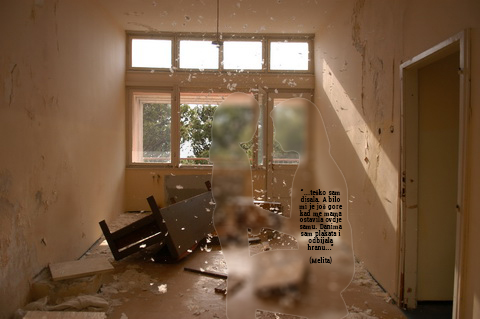
Spatial intervention consists of the main legend with basic information about the building and the purpose that project wants to achieve, and other silhouettes of children placed in the interior and exterior of the building. The idea is to get in touch with people who have stayed as children in the health resort Krvavica, to gather their anecdotes, and apply them to silhouettes.
Transparent silhouettes penetrate the surrounding space and symbolize ghosts frozen in time, something which is fading and now barely exists; lifeless lexan plates in contrast to the lively stories of children which use to stay there.
The silhouettes encourage visitors to move from one silhouette to another and thus they revive space, they explore the building, and they begin to realize its importance in cultural heritage. The aim is to stimulate emotions and engage people in the initiative to renew former health resort into a purposeful building – for example, an educational or cultural institution.
 Previous Project
 Next Project
- Categories:
- Skills:
- Share Project :
Previous ProjectNext Project