Client: Net Plus d.o.o.
Design studio: Design Studio Ivan Goran Žunar
Design: Ivan Goran Žunar
Year: 2018.
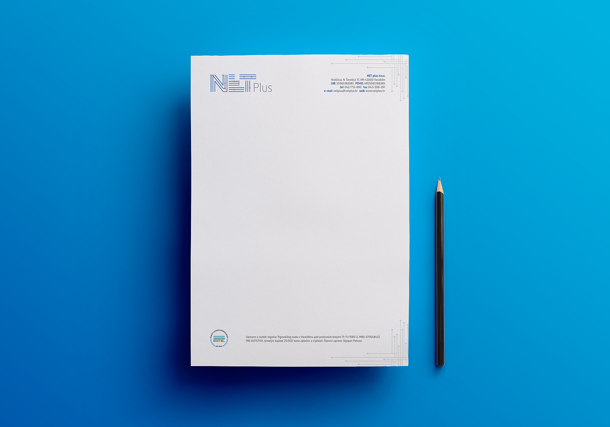
The task was to design a logo and the company data memorandum with application of corresponding ISO standard.
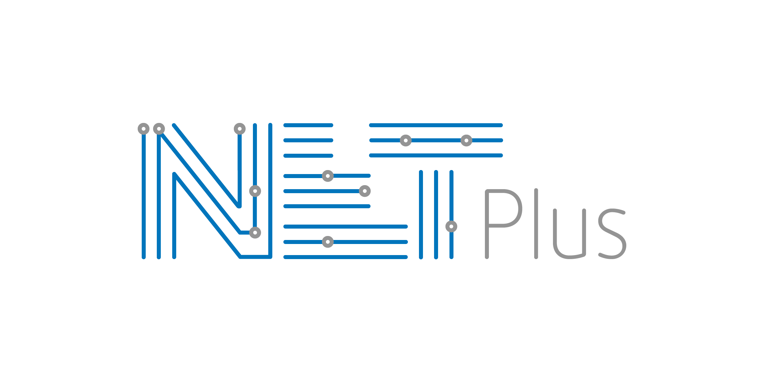
Net Plus is a company specialized in designing, developing, implementation and maintaining information systems with an aim to provide software solutions that are based on the latest advances in information technology that will ensure long-term security and quick return on investment to their clients.
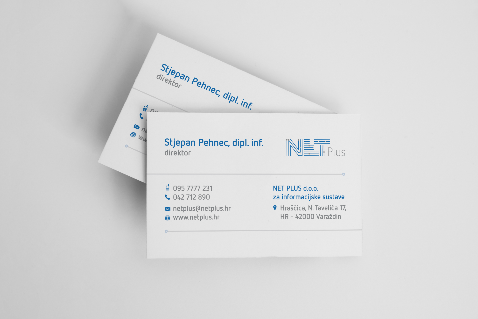
Identity is created using a motive of lines (= flow) and circles (= data) that symbolize flow of information, set into a geometrically constructed grid that represents a stable, secure and reliable system.
As such, identity is applied into the company logo and the pattern placed in the right corner of header and footer is framing basic information of the company.
The logo uses existing Net Plus combination of blue and gray color, and can also be used in combination of black and gray and in monochrome version.
 Previous Project
 Next Project
- Categories:
- Skills:
- Share Project :
Previous ProjectNext Project