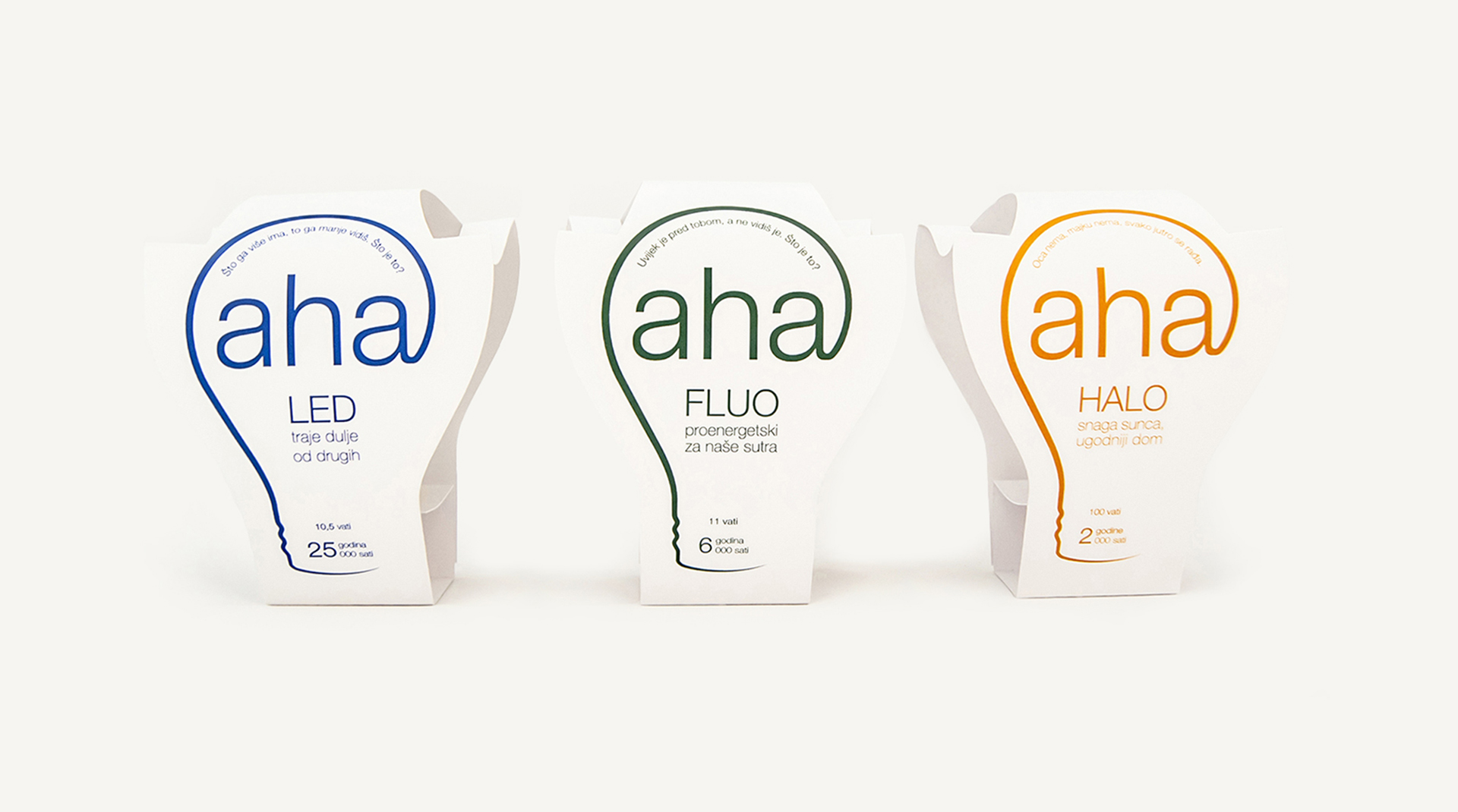
Aha light bulbs
Author: Ivan Goran Žunar
Institution: University of Zagreb, Faculty of Graphic Arts
Subject: Graphic Product Design
Subject holder: Ph. D. Jesenka Pibernik
Lecturer: M.Des. Izvorka Jurić
Assistant: M.Des. Filip Cvitić
Academic year: 2013./2014.
Exhibition and publishing:
Independent exhibition as a part of Tjedan dizajna (2015.)
Published in Vizkultura (2014.)
All the lightblub brands on the market are so generic, and they communicate mostly just technical characteristics - strength, duration and shape of the balloon. And that was the point in which Aha lightbulbs were born - lightbulbs with natural intensity and color of light which make people feel comfortable and innovative.
People use to say Aha when they get a good idea. And they usually get it when they use Aha lightbulbs. Aha is short, memorable and easily pronounced in every language. Each product in the series is coded with one color - LED bulbs with Yves Klein blue (symbol of eternity/duration) , fluorescent lightbulbs with green (eco-symbol) and halogen lightbulbs with yellow (symbol of natural light/sunlight). Each color corresponds to the slogan on the product. Used typography is Helvetica Light - corporative premium sans-serif typography. In transport packaging goes one into another allowing maximum use of space. Slot with wings and roller mantle fix the throat of lightbulbs in packaging so it can't move and upper wings on packaging hold a head of lightbulb and protect it in case of a fall. From an ecological point of view, there is no bonding, the entire package is compiled with maximum utilization of materials and printing only one Pantone color per product in the series.
In the context of Aha brand at all the packaging are put random enigmas that invite...
3/ 0/