Client: LotharWeiss d.o.o.
Design studio: Design Bureau Izvorka Juric / Motus Vis Inc.
Art direction: Izvorka Jurić
Design: Ivan Goran Žunar, Izvorka Jurić
Year: 2015.
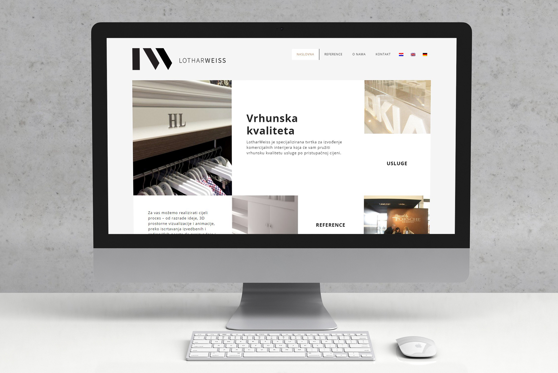
Lothar Weiss is a specialized company for the realization of commercial interiors, from design and manufacturing to equipment and facilities management. The company covers the entire process: conception, spatial 3D visualization, animation, rendering performing and workshop drawings, manufacture and assembly of prefabricated elements. Lothar Weiss emphasizes its personal contact with clients based on trust, high quality and many years of experience.
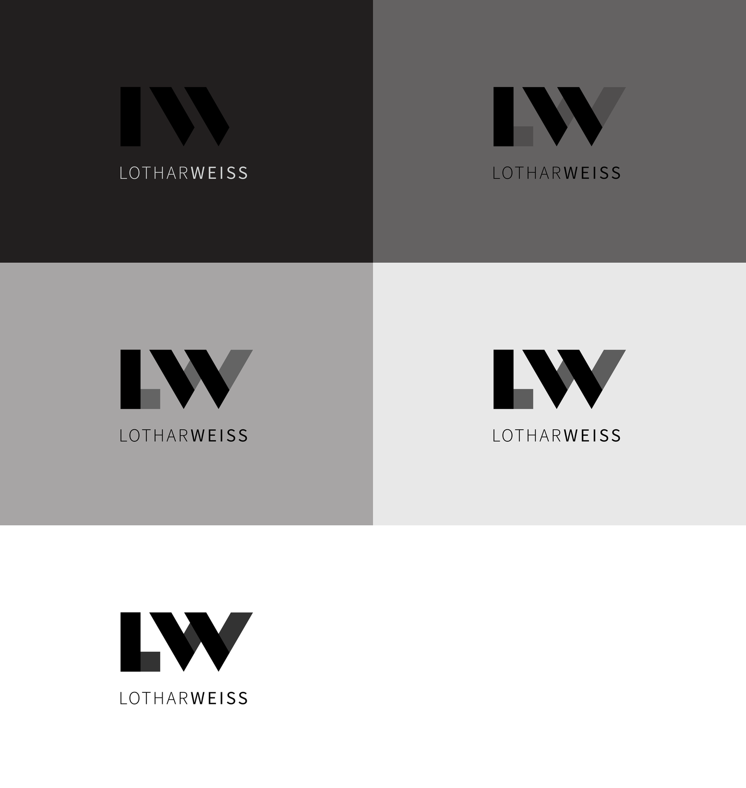
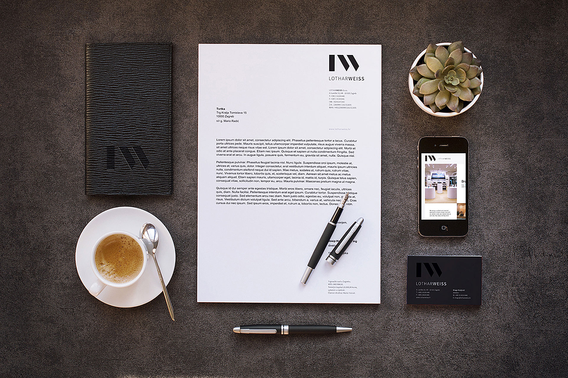
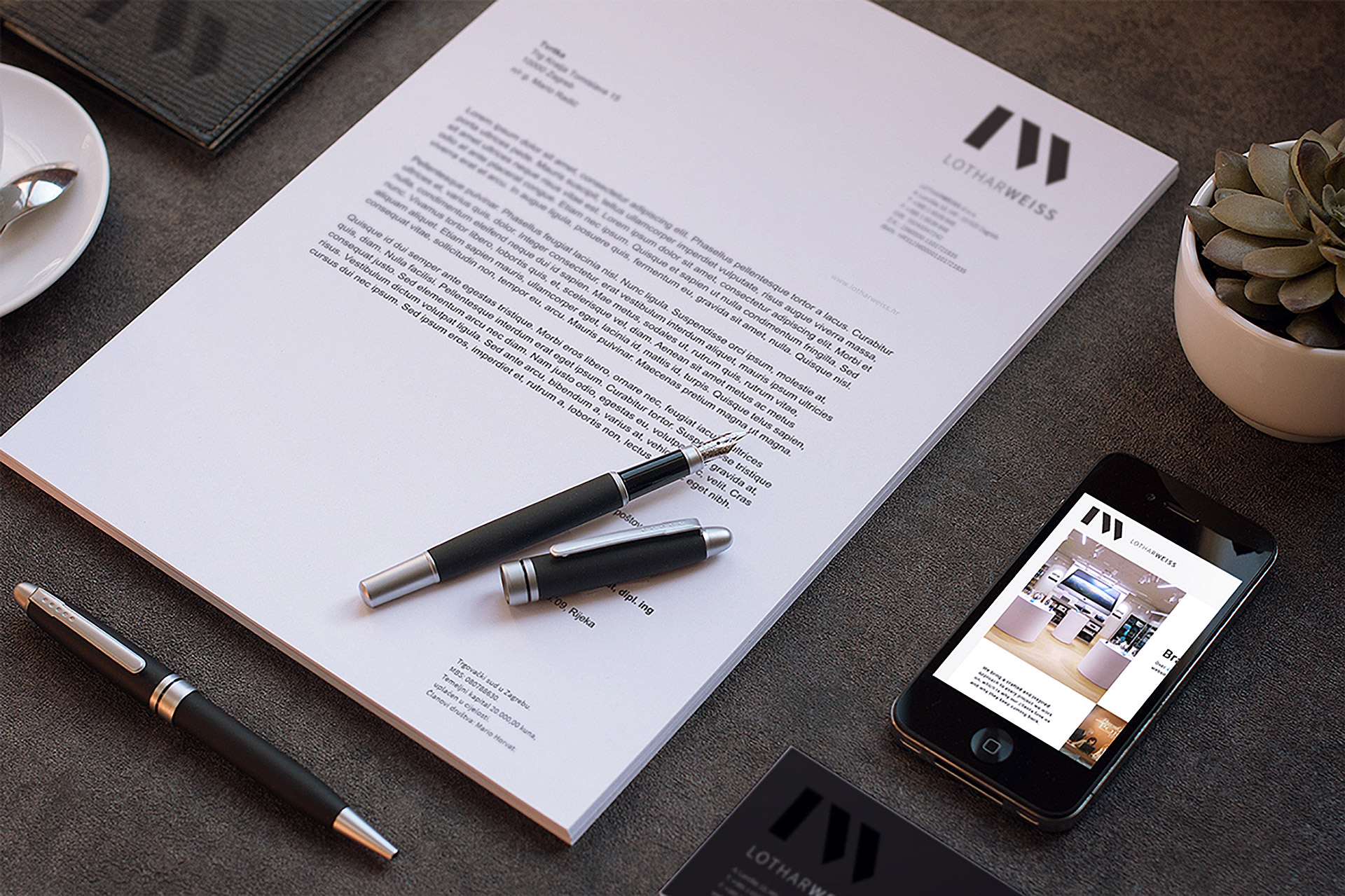
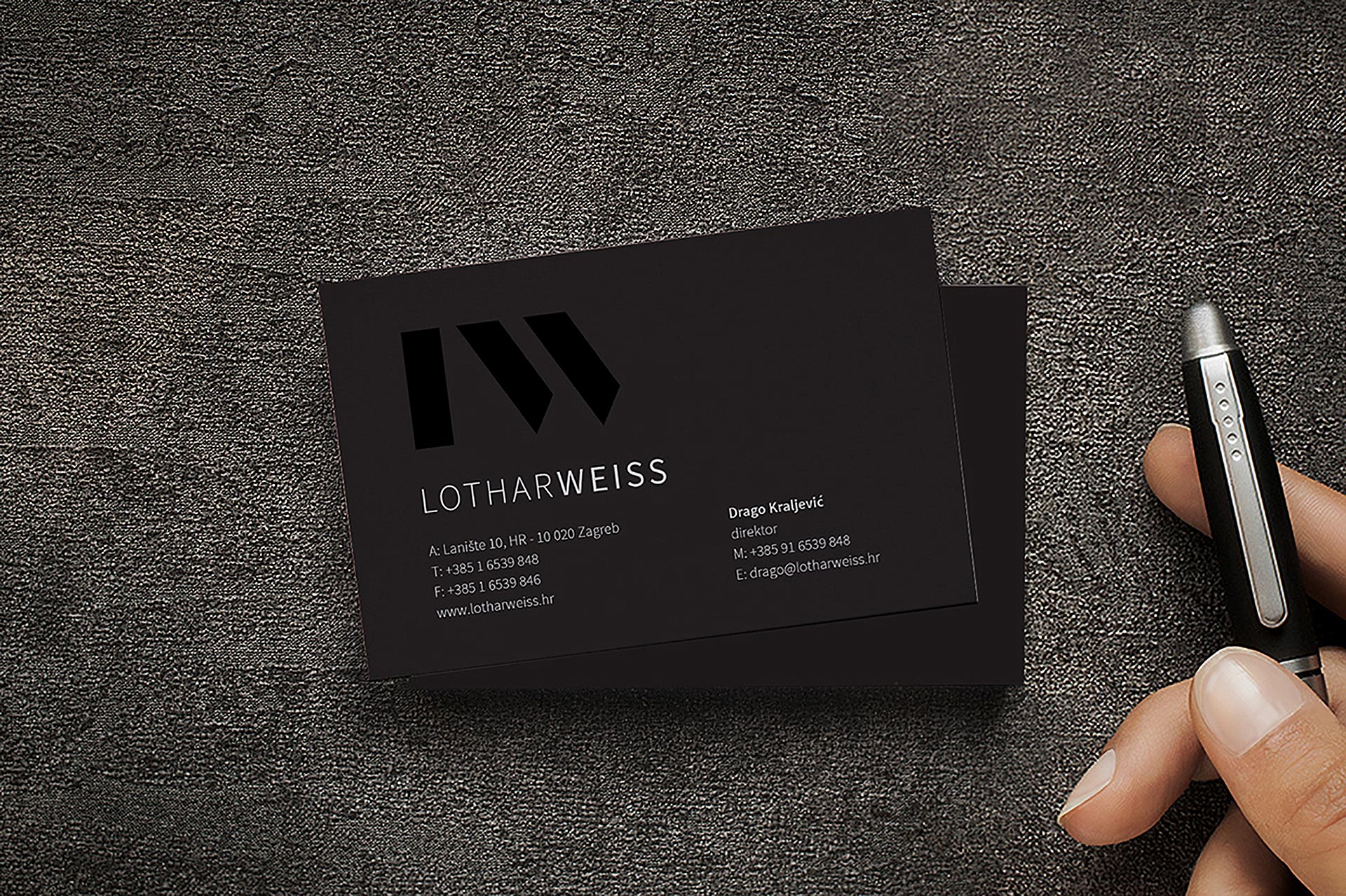
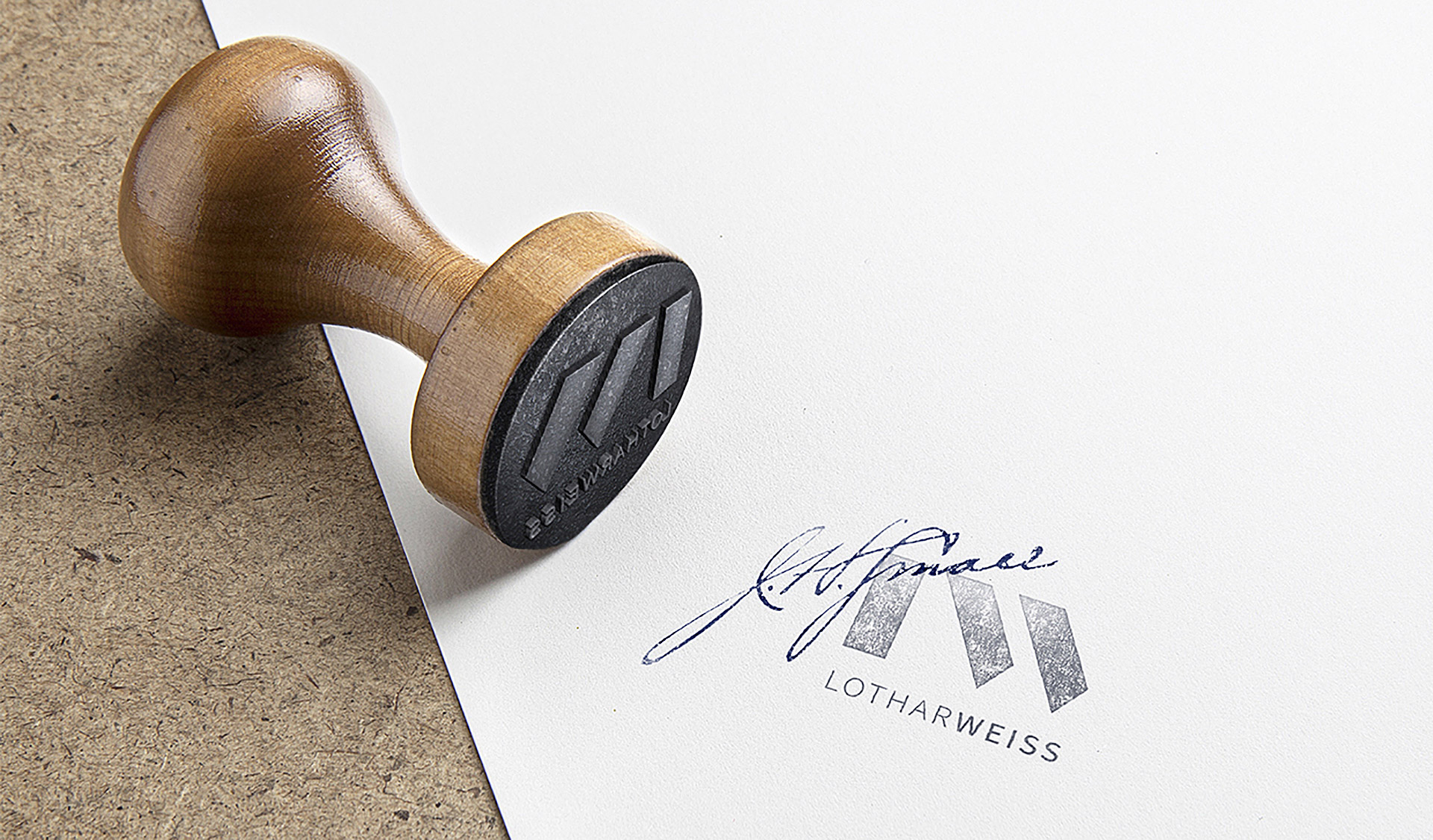
The identity has a minimalist set. With the reduction of the basic characters of the company’s name (L and W) a sign was formed that represents the construction of elements, building… but also communicates a strong vertical stability and the dynamic thinking with the use of diagonals. The identity is a design in black, white and shades of brown, and with the use of a “black on black” and “white on white” effect in the design of application. Using specific printing techniques (UV varnish, emboss stamping etc.) and materials (premium paper, leather, etc.) the identity communicates top quality services and creates a sophisticated look.
Original text available on: Design Bureau Izvorka Jurić
 Previous Project
 Next Project
- Categories:
- Skills:
- Share Project :
 Previous Project
 Next Project
