Medimar Prigorje Stationery

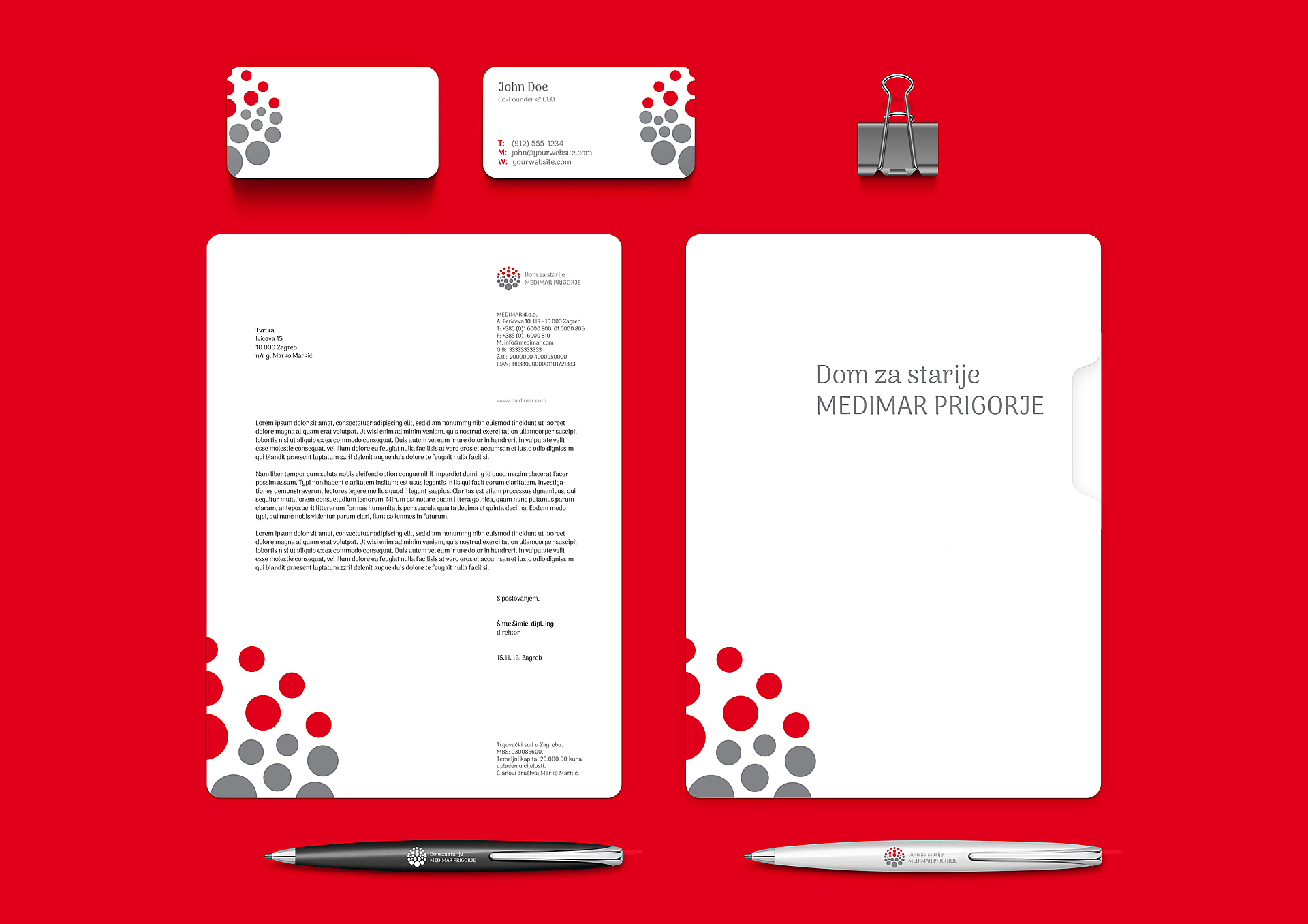
Senior care center Medimar Prigorje

/by
Client: Senior care center Dom Medimar Prigorje Design: Ivan Goran Žunar Year: 2016. Visual identity of the senior care center Medimar Prigorje was inspired by paintings of croatian naive art painter Ivan Rabuzin with an aim to communicate the feelings that Medimar Prigorje wants to convey - a feeling of communion and domestic atmosphere in the warmth of Croatian Zagorje's home. The logo shows the motif of sunny Zagorje's hills composed of circles of different sizes. This motif and circles as building elements were also used by Ivan Rabuzin in his paintings, and for the purpose of visual identity Medimar Prigorje were simplified to the level of logo, in three colors - red, gray and white – colors already existing in the interior and exterior of the building Medimar Prigorje. The logo is used in a combination with typogram or as a standalone element, and is used as a pattern in its entirety, half or upper quarter of it, in different applications of visual...

LotharWeiss

/by
Client: LotharWeiss d.o.o. Design studio: Design Bureau Izvorka Juric / Motus Vis Inc. Art direction: Izvorka Jurić Design: Ivan Goran Žunar, Izvorka Jurić Year: 2015. Lothar Weiss is a specialized company for the realization of commercial interiors, from design and manufacturing to equipment and facilities management. The company covers the entire process: conception, spatial 3D visualization, animation, rendering performing and workshop drawings, manufacture and assembly of prefabricated elements. Lothar Weiss emphasizes its personal contact with clients based on trust, high quality and many years of experience. The identity has a minimalist set. With the reduction of the basic characters of the company’s name (L and W) a sign was formed that represents the construction of elements, building… but also communicates a strong vertical stability and the dynamic thinking with the use of diagonals. The identity is a design in black, white and shades of brown, and with the use of a “black on black” and “white on white” effect in the design of application. Using specific printing techniques (UV varnish, emboss stamping etc.) and materials (premium paper, leather, etc.) the identity communicates top quality services and creates a sophisticated look. Original text available on: Design Bureau Izvorka...
Baggizmo

Baggizmo

/by
Client: Motus Vis Inc. Brand founder: Ladislav Jurić Creative/art direction: Izvorka Jurić Ivan Goran Žunar: design of the logo animation sound and music selection and editing GIF animations video tutorials - shooting, editing and composition As a part of a project: Design Bureau Izvorka Jurić Year: 2015. Project Links: Kickstarter Indiegogo Croatian Design Exhibition 1516 Awards Museum of Arts and Crafts The visual identity contains specific lines and forms that are set in the product itself and the communication is based on values and emotions set in the strategy. Due to the added value of these bags – the smart design, high functionality and attractive appearance – branding is supposed to communicate through sophisticated, refined, elegant visuals that would be attractive to the modern man and with smart creative communication. The name communicates the basic essence of the product – Baggizmo – blending the concepts of ‘bag’ and ‘gizmo.’ The product is positioned as a combination of technology (gadget aware) and contemporary urban fashion – bag that lives in the world of fashion and technology. The space inside Baggizmo is rationally organized – the direction and the size of the compartments depend on the size of its corresponding device – which are: a tablet, two smartphones, keys, wallet, power stick, pencil and a pad of paper, etc. In between the compartments there are specially tailored (hidden) passages which allow the charging of a tablet with a power stick or connecting a phone with headphones. The campaign was successfully completed collecting $44,000 in order to start production based in Croatia. In the first 24 hours of the campaign Baggizmo generated more than...

Žunar Wines

/by
Gloss Clear Polyester labels (GCP) for 3 wine products of family Žunar are designed: Manzoni, Cabernet Sauvignon and Graševina. Leitmotif that empasizes whole design is a wine stain made with a glass on the tablecloth. Manufactured exclusively for personal...
Packaging front

Aha light bulbs

/by
Author: Ivan Goran Žunar Institution: University of Zagreb, Faculty of Graphic Arts Subject: Graphic Product Design Subject holder: Ph. D. Jesenka Pibernik Lecturer: M.Des. Izvorka Jurić Assistant: M.Des. Filip Cvitić Academic year: 2013./2014. Exhibition and publishing: Independent exhibition as a part of Tjedan dizajna (2015.) Published in Vizkultura (2014.) All the lightblub brands on the market are so generic, and they communicate mostly just technical characteristics - strength, duration and shape of the balloon. And that was the point in which Aha lightbulbs were born - lightbulbs with natural intensity and color of light which make people feel comfortable and innovative. People use to say Aha when they get a good idea. And they usually get it when they use Aha lightbulbs. Aha is short, memorable and easily pronounced in every language. Each product in the series is coded with one color - LED bulbs with Yves Klein blue (symbol of eternity/duration) , fluorescent lightbulbs with green (eco-symbol) and halogen lightbulbs with yellow (symbol of natural light/sunlight). Each color corresponds to the slogan on the product. Used typography is Helvetica Light - corporative premium sans-serif typography. In transport packaging goes one into another allowing maximum use of space. Slot with wings and roller mantle fix the throat of lightbulbs in packaging so it can't move and upper wings on packaging hold a head of lightbulb and protect it in case of a fall. From an ecological point of view, there is no bonding, the entire package is compiled with maximum utilization of materials and printing only one Pantone color per product in the series. In the context of Aha brand at all the packaging are put random enigmas that invite...