Apsolon HDI icons and illustrations

HDI visual identity and vector graphics for a web page

/by
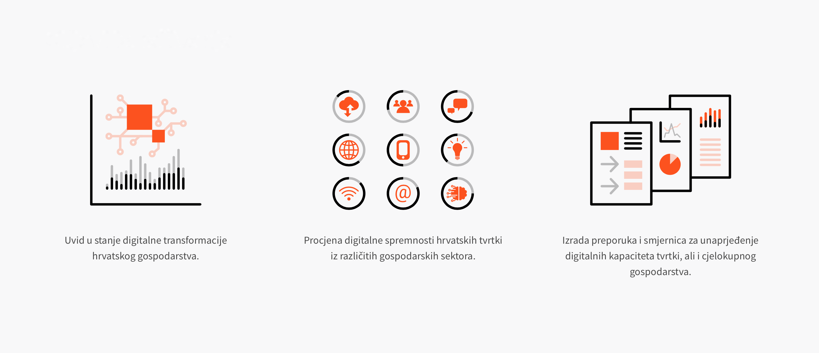
Client: Apsolon d.o.o. Company: Bit4Bytes d.o.o. in cooperation with Design Studio Ivan Goran Žunar Design: Ivan Goran Žunar Year: 2019. See the web page HDI or Croatian Digital Index is a project of Apsolon company - leading regional business consulting company, and it represents an online form which allows individual companies to estimate a degree of their digitization and readiness for challenges imposed by digital transformation of society and business. It also gives a set of recommendations and guidelines for enhancement of digital capacities of the company. Visual identity of HDI project is derived from the visual identity of Apsolon - its color system, typography and styling. Above HDI initials are added points which represent heads in relation to the initials which in this context semantically represent bodies. In this way cold HDI initials are personified - human component is given to Croatian Digital Index, because, in essence, digital transformation is made of people - it is made of the changes of economic, social and political relations and communication methods due to digitization process; and the consequences of this process directly affect people and business. The illustrations and pictograms on the website also follow the linear-flat design set in the visual identity of the Apsolon company, and the symbols have been taken from the commonly used symbols for particular terms - digital signal, digitization, networking, Croatia, research results, cloud computing, society, communication , Internet, mobile technology, innovation, wifi, e-mail, readiness and strategy; which are therefore understandable to...
Alfa Stan visual identity

Alfa Stan

/by
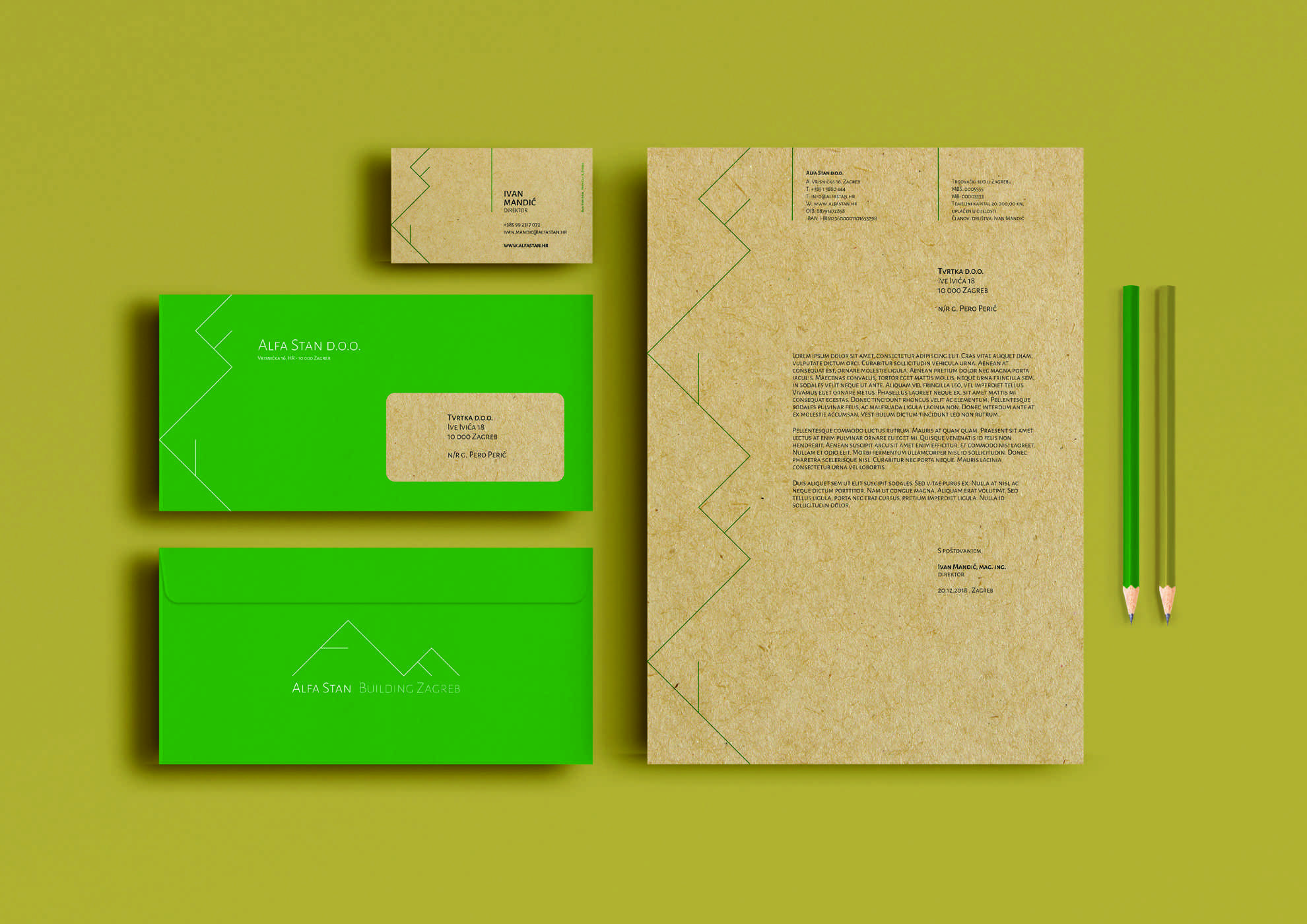
Client: Alfa Stan d.o.o. Design studio: Design Studio Ivan Goran Žunar Design: Ivan Goran Žunar Year: 2018. New visual identity Alpha Stan follows linear figuration set in the current visual identity, but at the same time it rises it to a new level using right triangle shape with lines going out from the central point of catheti. Visual identity thus semantically reflects the occupation of housing construction and can also be disassembled into letters which make the word Alfa. The visual identity is airy, lightweight and gives the impression of world-class premium product. The primary color of visual identity is green - the color of nature, ecology; and secondary color is the color of old gold which gives to visual identity impression of timeless luxury. In accordance with the company's environmental awareness, Alfa Stan visual identity will be applied to recycled paper which will further communicate the pro-environmental activity of the company to Alfta Stan's...
Bit4Bytes business card

Bit4Bytes

/by
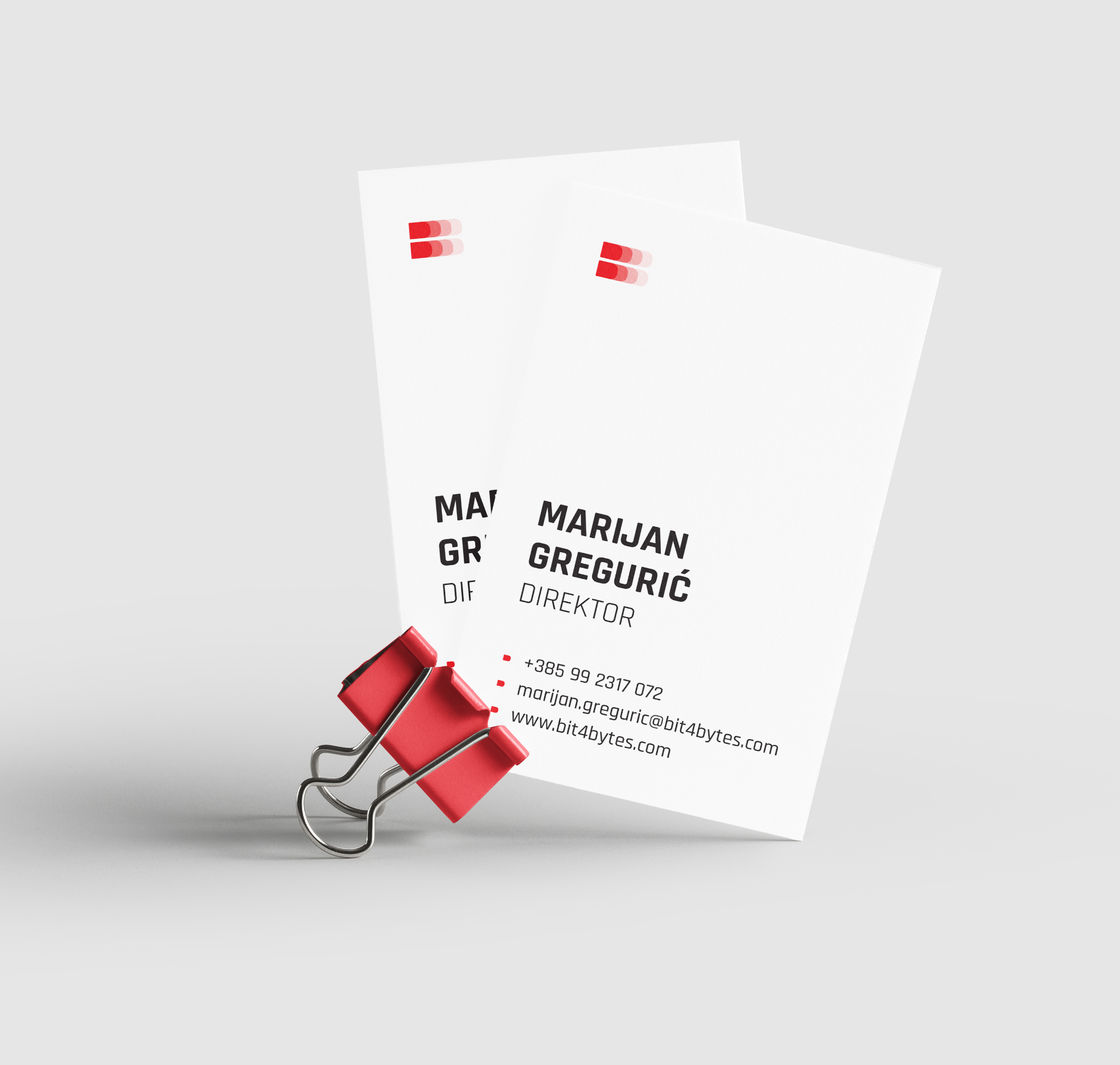
Client: Bit4Bytes d.o.o. Design studio: Design Studio Ivan Goran Žunar Design: Ivan Goran Žunar Year: 2018. Bit4Bytes is a company specialized primarily in designing, developing, deploying and maintaining information systems, and it outsources external collaborators, not just from the IT sector, but also gathers UX / UI and graphic designers, copywriters, photographers and more, expanding their business range outside their primary occupation. Bit is a metaphor of a collaborator who works to achieve company goals (bytes) - a series of independent collaborators (bits) work together to achieve common goals / projects (bytes). The name is implemented as such in the company's visual identity and overall communication. A particular segment of the logo (bit) is made from the letter B of Bit4Bytes...