Apsolon business report design

Design of Apsolon business report

/by
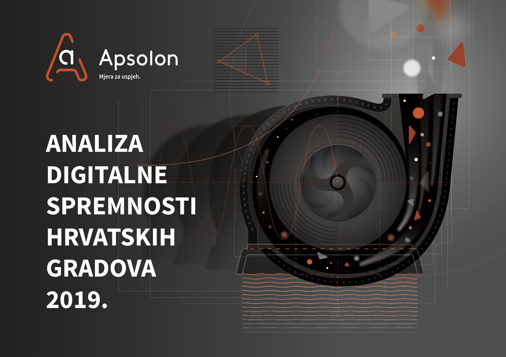
Client: Apsolon d.o.o. Company: Bit4Bytes d.o.o. in cooperation with Design Studio Ivan Goran Žunar Creative and Art Direction: Ivan Goran Žunar Design, text and tables editing and prepress: Ivan Goran Žunar Design of graphs and diagrams: Vanja Medak Year: 2019. Design of business report Analiza digitalne spremnosti hrvatskih gradova 2019. by Apsolon d.o.o. company is based on Apsolon's visual identity - color system, typography and style. The element of rounded triangle is derived from Apsolon logo, and it is used as the main pattern of the entire publication. Its role is to distinguish different parts of the publication - the main titles, by varying transparency - full color and 50% transparent. Subtitles of the first hierarchical level are emphasized in bold type, subtitles of the second hierarchical level are emphasized in color, and subtitles of the third hierarchical level are emphasized in color and cursive type. Emphasized parts of the text are emphasized in bold type. The text is edited in a 4-column grid, which provides optimal readability of the text in printed form, in accordance with the size and number of characters in one row of the column. Graphs, diagrams and tables are formed by varying the color and thickness of the line with rounded endings according to the style of Apsolon's visual identity. Quotes of individual Apsolon's specialists are emphasized in color and photographs within the publication, giving thus a personalized note to the overall design and closing up semantic parts of the...
Alfa Stan visual identity

Alfa Stan

/by
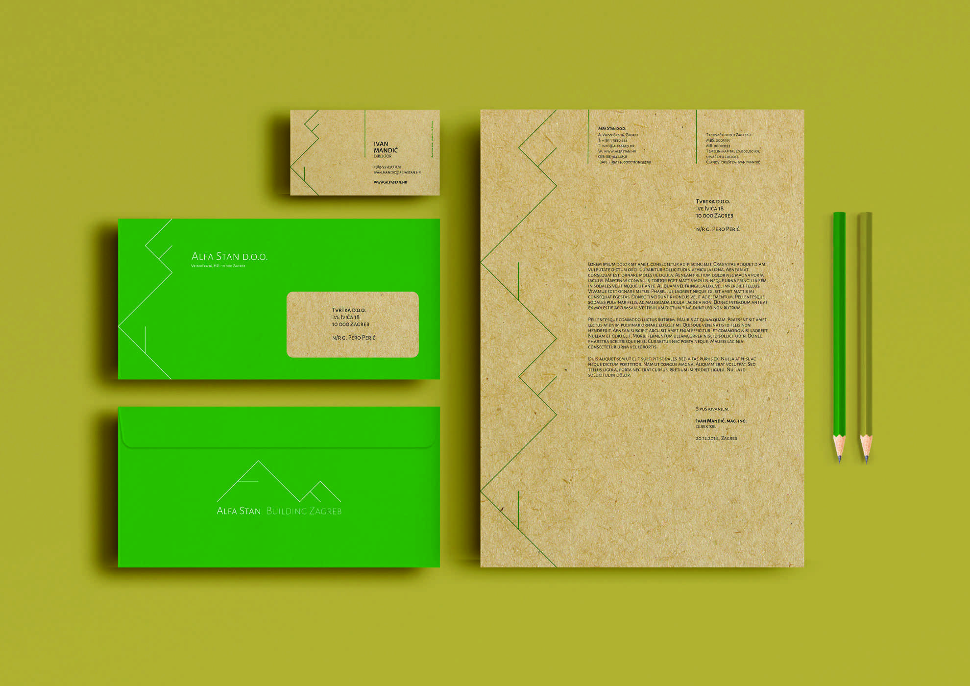
Client: Alfa Stan d.o.o. Design studio: Design Studio Ivan Goran Žunar Design: Ivan Goran Žunar Year: 2018. New visual identity Alpha Stan follows linear figuration set in the current visual identity, but at the same time it rises it to a new level using right triangle shape with lines going out from the central point of catheti. Visual identity thus semantically reflects the occupation of housing construction and can also be disassembled into letters which make the word Alfa. The visual identity is airy, lightweight and gives the impression of world-class premium product. The primary color of visual identity is green - the color of nature, ecology; and secondary color is the color of old gold which gives to visual identity impression of timeless luxury. In accordance with the company's environmental awareness, Alfa Stan visual identity will be applied to recycled paper which will further communicate the pro-environmental activity of the company to Alfta Stan's...
Bit4Bytes business card

Bit4Bytes

/by
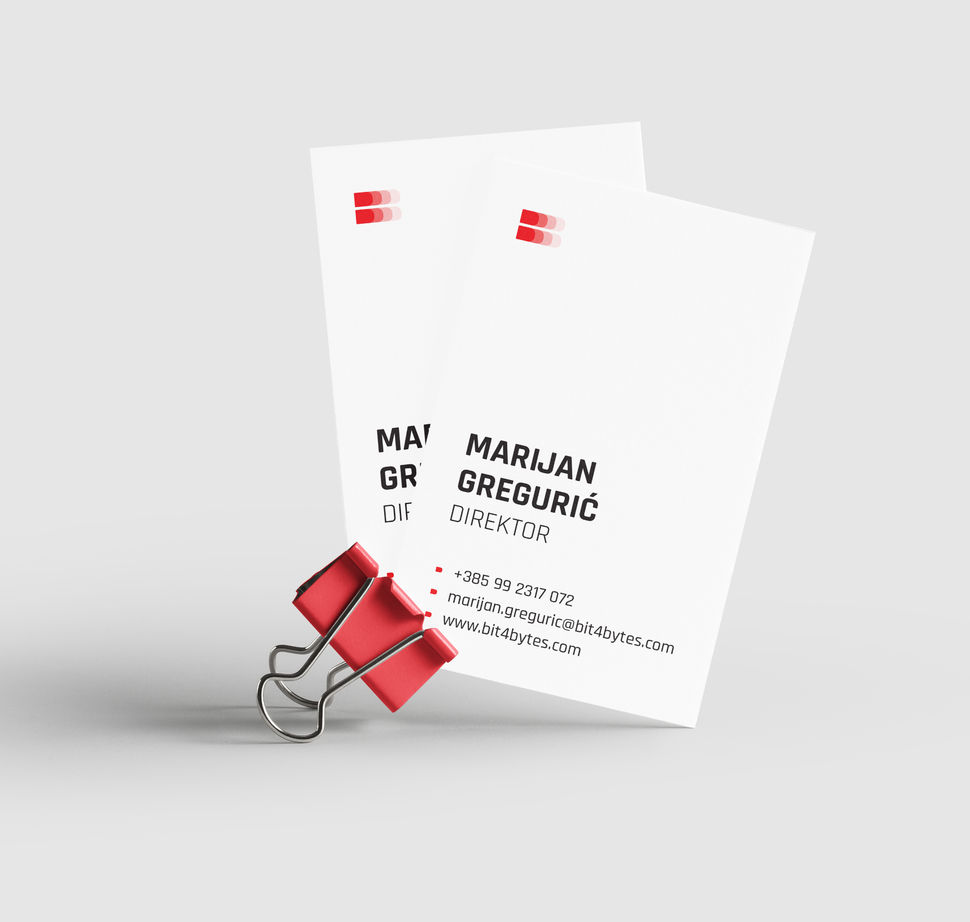
Client: Bit4Bytes d.o.o. Design studio: Design Studio Ivan Goran Žunar Design: Ivan Goran Žunar Year: 2018. Bit4Bytes is a company specialized primarily in designing, developing, deploying and maintaining information systems, and it outsources external collaborators, not just from the IT sector, but also gathers UX / UI and graphic designers, copywriters, photographers and more, expanding their business range outside their primary occupation. Bit is a metaphor of a collaborator who works to achieve company goals (bytes) - a series of independent collaborators (bits) work together to achieve common goals / projects (bytes). The name is implemented as such in the company's visual identity and overall communication. A particular segment of the logo (bit) is made from the letter B of Bit4Bytes...
NET Plus Memo

NET Plus

/by
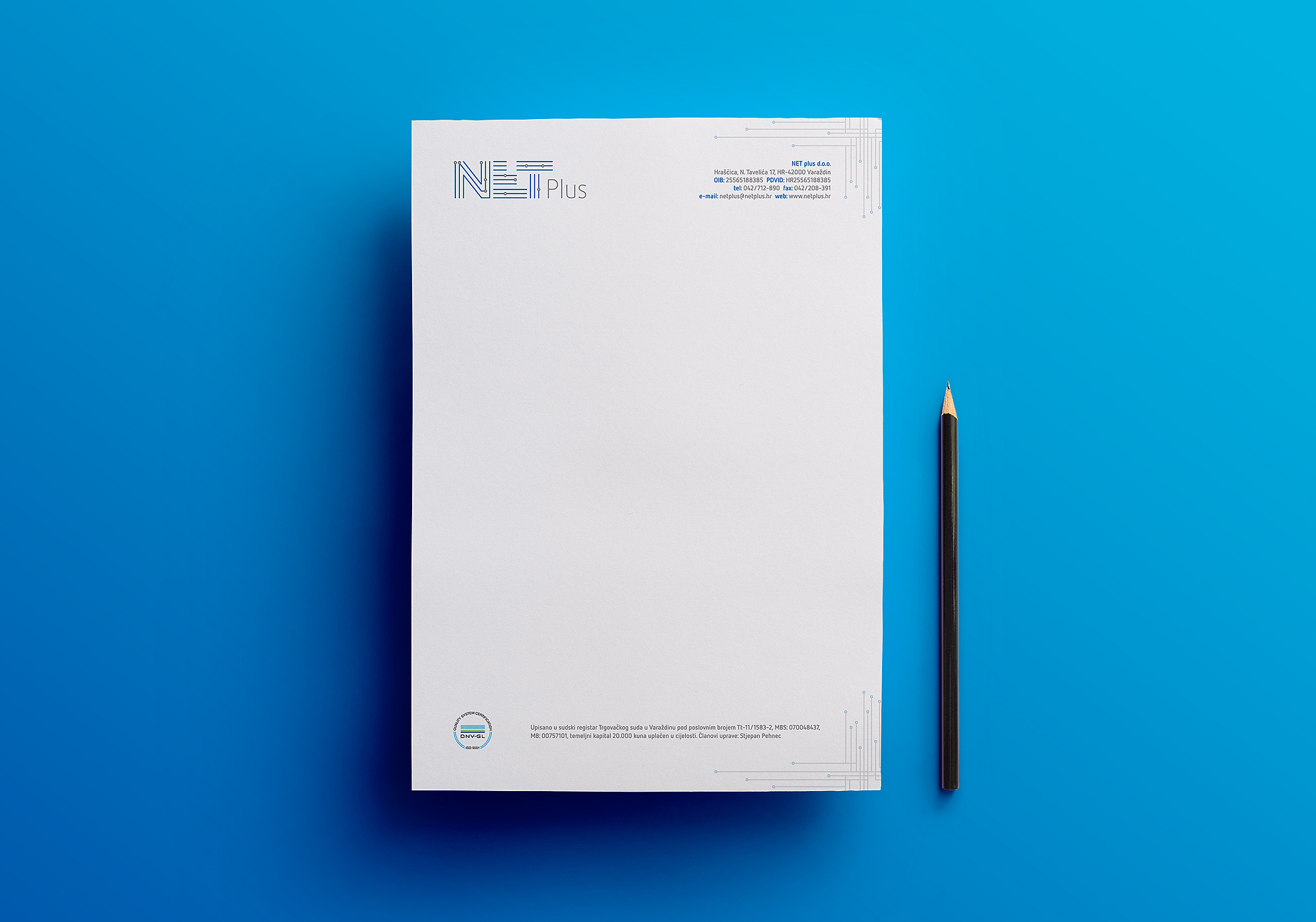
Client: Net Plus d.o.o. Design studio: Design Studio Ivan Goran Žunar Design: Ivan Goran Žunar Year: 2018. The task was to design a logo and the company data memorandum with application of corresponding ISO standard. Net Plus is a company specialized in designing, developing, implementation and maintaining information systems with an aim to provide software solutions that are based on the latest advances in information technology that will ensure long-term security and quick return on investment to their clients. Identity is created using a motive of lines (= flow) and circles (= data) that symbolize flow of information, set into a geometrically constructed grid that represents a stable, secure and reliable system. As such, identity is applied into the company logo and the pattern placed in the right corner of header and footer is framing basic information of the company. The logo uses existing Net Plus combination of blue and gray color, and can also be used in combination of black and gray and in monochrome...
Vid Caffe business file

Vid Caffe business file

/by
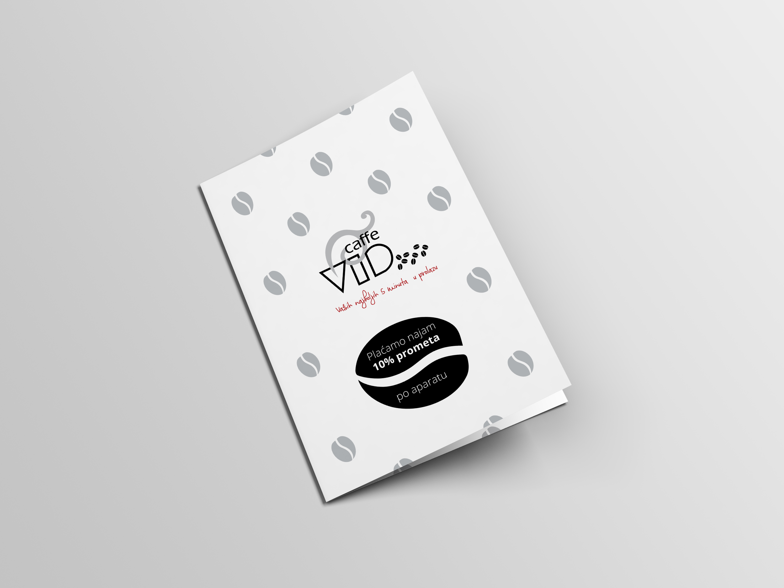
Client: Vid Caffe d.o.o. Design studio: Design Studio Ivan Goran Žunar Design and copywriting: Ivan Goran Žunar Year: 2018. The business file A3 size in open format was ordered, with elements to use in designing: the motif of coffee, red and black color, the text and the illustration of offered coffee flavors on vendig machine. It was also ordered to come up with a slogan that would suggest an emotional connection between consumer and the coffee maker. Chosen design solution is inspired by the wave dynamics, the moment of getting inspiration while waking-up after drinking coffee from vendig machine. Also, the waveform corresponds well with the company's logo, and according to this concept, the slogan is created "A moment of pure inspiration". Second design solution is the purified visualization created through the literal interpretation of the brief and it is using only the elements mentioned in the brief - the motif of coffee, red and black color, the images of vendig machines and the illustration of the offered flavors of coffee. The slogan is also literally created - "When the heart says Vid Caffe" using heart motif in the form of coffee. The third design solution went in a similar direction as previous design solution using an illustration instead of photography. Red color in this solution is reduced to the detail. And the slogan is: "Vid Caffe - your the best 5 minutes in the...
Krvavica logo inspiration

Pediatric marine health resort Krvavica

/by
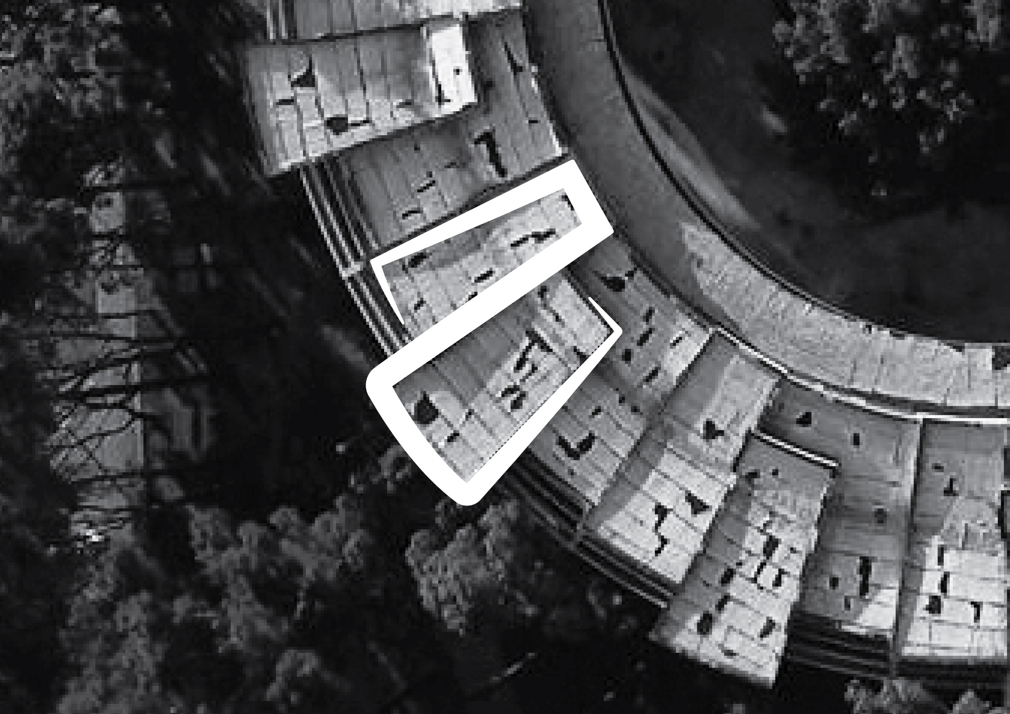
Client: Loose Associations - association for contemporary artistic practices Design studio: Design Studio Ivan Goran Žunar Design: Ivan Goran Žunar Year: 2018. Logo of Pediatric marine health resort Krvavica consists of a sign shaped according to the characteristic motif of the roof on a building and it is characterized with dynamic spiral of movement achieved with slant lines varying in thickness and permeation of closed and open space according to the typology of architecture and the typogram whose serifs follow the dynamics of movement in the sign, emphasized by the contrast of smaller and larger, and thicker and thinner. Spatial intervention consists of the main legend with basic information about the building and the purpose that project wants to achieve, and other silhouettes of children placed in the interior and exterior of the building. The idea is to get in touch with people who have stayed as children in the health resort Krvavica, to gather their anecdotes, and apply them to silhouettes. Transparent silhouettes penetrate the surrounding space and symbolize ghosts frozen in time, something which is fading and now barely exists; lifeless lexan plates in contrast to the lively stories of children which use to stay there. The silhouettes encourage visitors to move from one silhouette to another and thus they revive space, they explore the building, and they begin to realize its importance in cultural heritage. The aim is to stimulate emotions and engage people in the initiative to renew former health resort into a purposeful building - for example, an educational or cultural...
Beko social media post

Beko social media posts

/by
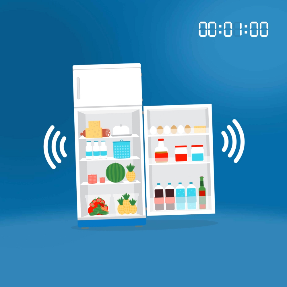
Client: Beko Agency: Akterpublic d.o.o. Design and motion graphics: Ivan Goran Žunar Social media manager: Bojana Križić Year: 2017. All creative solutions are based on Beko visual identity and design guidelines – defined Beko color palette, low structured and flat-shaped illustrations and narrative visual...
Pittarosso social media post

Pittarosso social media posts

/by
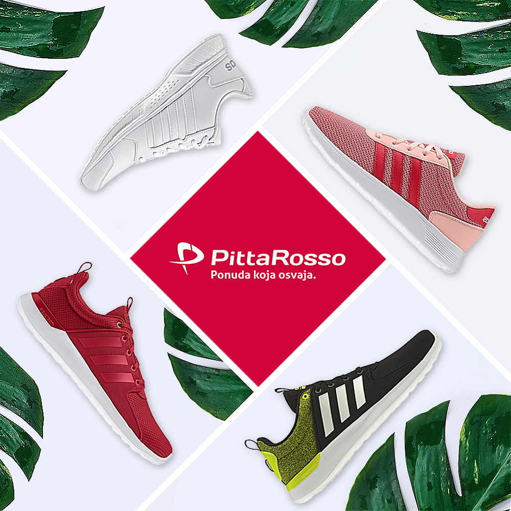
Client: Pittarosso Agency: Akterpublic d.o.o. Design: Ivan Goran Žunar Social media manager: Bojana Križić, Suzana Janjić Year: 2017. See original post See original post See original post See original post See original post See original post See original post See original post See original post See original post See original post See original post See original post See original post See original post See original post See original post See original post See original post See original post See original post See original post See original post See original post See original...
Good solutions always come to the surface

Good solutions always come to the surface

/by
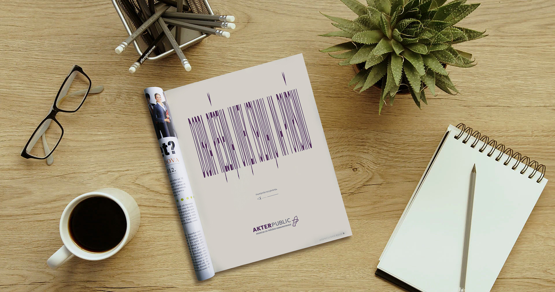
Client: Akterpublic d.o.o. Agency: Akterpublic d.o.o. Creative and art direction: Marijeta Grizelj Babić Copywriting: Igor Novaković Design: Ivan Goran Žunar Year: 2017. Advertisement Good solutions always come to the surface, designed for the marketing agency Akterpublic d.o.o, published in the special edition Agencijsko bilo of the business magazine Lider, is an example of interactive design of a printed advertisement, in which the angle that the observer's eye closes with plane of the paper is put in relation with readability of the message. Letters have been intentionally stretched to the unreadability of message, so that at a viewing angle of 90 degrees relative to the plane of a paper, the message is unreadable, but reducing the viewing angle to 0 degrees in relation to the plane of the paper results in an increasing perspective of the image the observer sees, and it reveals the message: "Good solutions always come to the surface". The solution is, in this way, by changing the viewing angle of the observer, literally drifting from depth to the surface of the...